Simplifying the Photography Booking Experience
PhotoBook Pro
UX Writing Case Study
Overview
PhotoBook Pro streamlines the client booking and print ordering process for professional photographers. This case study explores how strategic UX writing helped create a more intuitive and engaging user experience.
Challenge
Professional photographers faced three key challenges:
1. Time-consuming manual booking processes
2. Complex print package explanations
3. Unclear client communication flows
I aimed to use clear, consistent, and friendly microcopy to simplify these processes while maintaining a professional tone.
User Research
Key Findings
- 78% of photographers spent 5+ hours weekly on booking administration
- 65% of clients were confused about print package options
- 82% of booking inquiries required multiple follow-up emails
User Pain Points
- "I never know what to write in client emails"
- "Explaining print packages takes too much time"
- "Clients get confused about what happens next"
Writing Strategy
Voice and Tone Principles
- Professional yet warm: Building trust while remaining approachable
- Clear and concise: Eliminating industry jargon
- Action-oriented: Guiding users through each step
- Empathetic: Acknowledging the emotional nature of portrait photography
Booking Flow
“What kind of portrait are you looking for?” felt impersonal, so I changed it to “What Can We Create Together?”
I suggested swapping the text field to a drop-down menu to align the users and photographers with uniform terminology. The “Other” choice can be explained on a future screen where the user can add a note just before booking. This way, they can communicate all of their concerns in one place.
The Style Guide asks or a warm and professional tone, so ”Select date” became “Choose Your Perfect Day.”
The “Submit” button became the action-oriented “Start Your Portrait Journey.”
I added microcopy to provide the user with enough information and support the emotional nature of portrait photography.
Print Collections
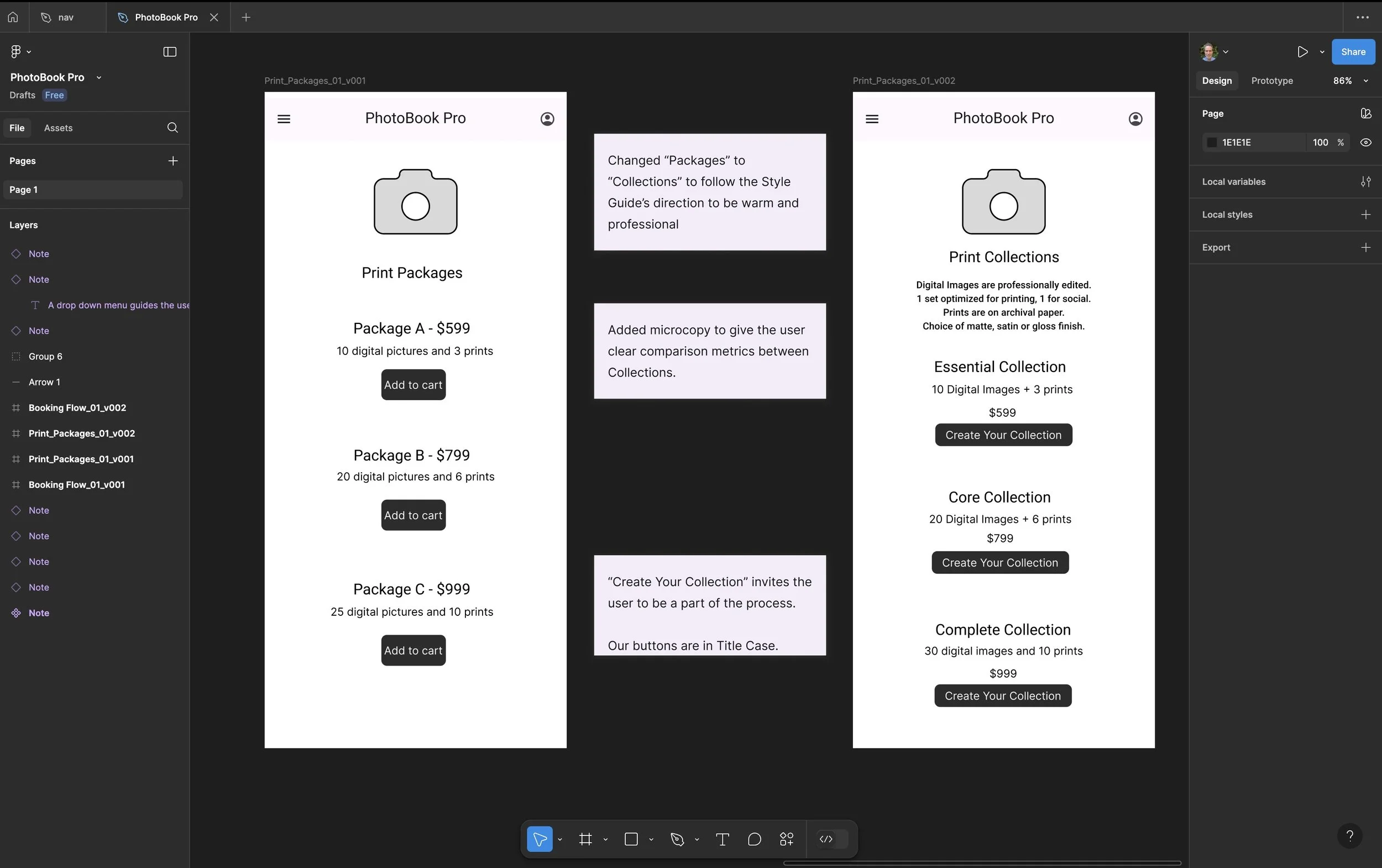
I felt that “Print Packages” sounded slightly generic, so I modified it to “Print Collections.”
I gave each Collection a specific name to be more cohesive to the entire, elevated portrait experience.
Before: "Package A - $599"
After: "Essential Collection: 10 Digital Images + 3 Prints - $599”
Before: "Package B - $799"
After: "Core Collection: 25 Digital Images + 6 Prints - $599”
Before: "Package C - $999"
After: "Complete Collection: 30 Digital Images + 10 Prints - $999"
Before: "Add to cart"
After: "Create Your Collection"
I added microcopy to give the user enough information to select the right Collection for them.
“Add to cart” became “Create Your Collection” to unify the messaging.
Using the Style Guide as a reference, I adjusted the headings and buttons on both screens to title case.
Email Templates
I created email templates to address the user’s pain points.
A sample PDF can be found HERE.
Impact
The UX writing improvements contributed to:
- Increased booking conversions
- Higher average order value
- Improved client satisfaction
- Reduced support needs
- Stronger brand loyalty
Next Steps
- Implement A/B testing for key conversion points
- Develop localized content for international markets
- Create additional automated communication flows
- Expand help documentation based on user feedback
Conclusion
The biggest lesson from this experience is that emotion matters.
Portrait photography is personal, and our writing needs to reflect that.
We kept the language simple and consistent to ease client and user pain points.
By staying empathetic to the user as they go through the various flows, we guided them to an enjoyable and rewarding experience.


