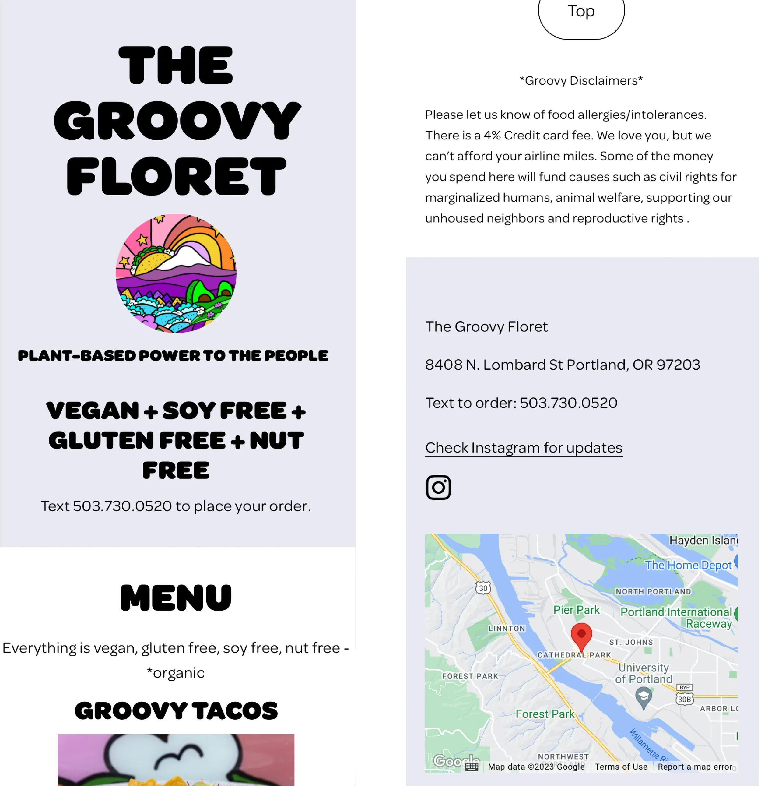
The Groovy Floret
UX writing, content design, SEO, and CMS
Project overview
The Groovy Floret is a plant based restaurant with an established brand vision.
They needed a website:
To introduce themselves to the world.
That integrates a “text to order” function, an established protocol their customers already love.
That has an intuitive CMS system that they could easily update.
My Contribution
The owner of my favorite food-cart-turned-brick-and-mortar restaurant asked me to build them a website with the ability to order online. I consulted with Two Wolves Creative to work with a team and provide better service.
Our users would be the restaurant’s owner and customers.
After meeting with the owner, I observed the restaurant workflow, conducted customer research and went through competitor’s websites and social media. I lead the team on web design, content, SEO and CMS strategy.
The Result
Soon after launch, the restaurant reported a 20% increase on text orders, 10% increase in dine-in customers.
Case Study
After collecting the research, our first attempt to solve the puzzle was to wireframe the website with a landing page, a menu page and an about page. We planned future pages to be added as the business expands.
We chose to host the site on Squareup, a platform that links directly to the restaurant’s existing POS. Customers could could download an app, create an account, archive favorite orders and pay via the app.
Through interviews we learned that our users preferred the direct, human experience of texting their order and receiving a personalized response - thanks for the order and an estimated time of completion.
Customers did not want to set up an account or install an app to order. The human interaction is a component of the restaurant’s appeal.
The owner agreed with the customers in wanting to keep the interaction as simple and human as possible. Customer interaction at the time of pickup encouraged future dine-in visits. Increasing dine-in visits is one of the owner’s goals.
We found that on most hosting platforms people could email a text message from their desktops. The owner wanted everything to happen over text, not a mix of text and email. They also preferred to start with the simplest site possible with the ability to integrate new pages in the future.
We pivoted our thinking to incorporate all of the feedback.
Our research led us to wireframe a one page site hosted by Squarespace. This platform has the capability to create a “Text to Order” button, a function that works seamlessly on mobile devices, opens the messaging app on a desktop and flows like a normal text conversation for the restaurant and the customer. I added on page copy reading “Text to Order 503…” so a user would have the information in case there was a glitch with the website or a user’s device.
While discussing the final design details we came to a sticking point with the font choice. The owner wanted to use the same font as the signage in the restaurant to maintain brand integrity.
I thought it wouldn’t be as accessible on a mobile device, so we conducted A/B testing. The owner respects the concept of accessibility and the results of the testing led us to choose a mobile friendly font.
User feedback told us that the “Text To Order” button was unnecessary, confusing and cluttered the design. Most mobile devices pull up a list to message or call the number if the number is held. We removed the button.
Before
After
Squarespace also allowed us to build future page templates and an overall CMS and SEO plan for the client that can be passed on to a developer as the business grows.
Going through the research and adjustments to feedback have yielded great results. Customer and restaurant owner satisfaction with the ordering process has increased as has the number of dine-in visits.


